Sales intelligence tools: 5 layers, 5 different leaks, one you actually have
Sales intelligence tools compared by layer: 10 B2B sales intelligence platforms, from contact data to signals. Find your gap first, then test it free.


Sales intelligence tools: the 5 layers sold as one category
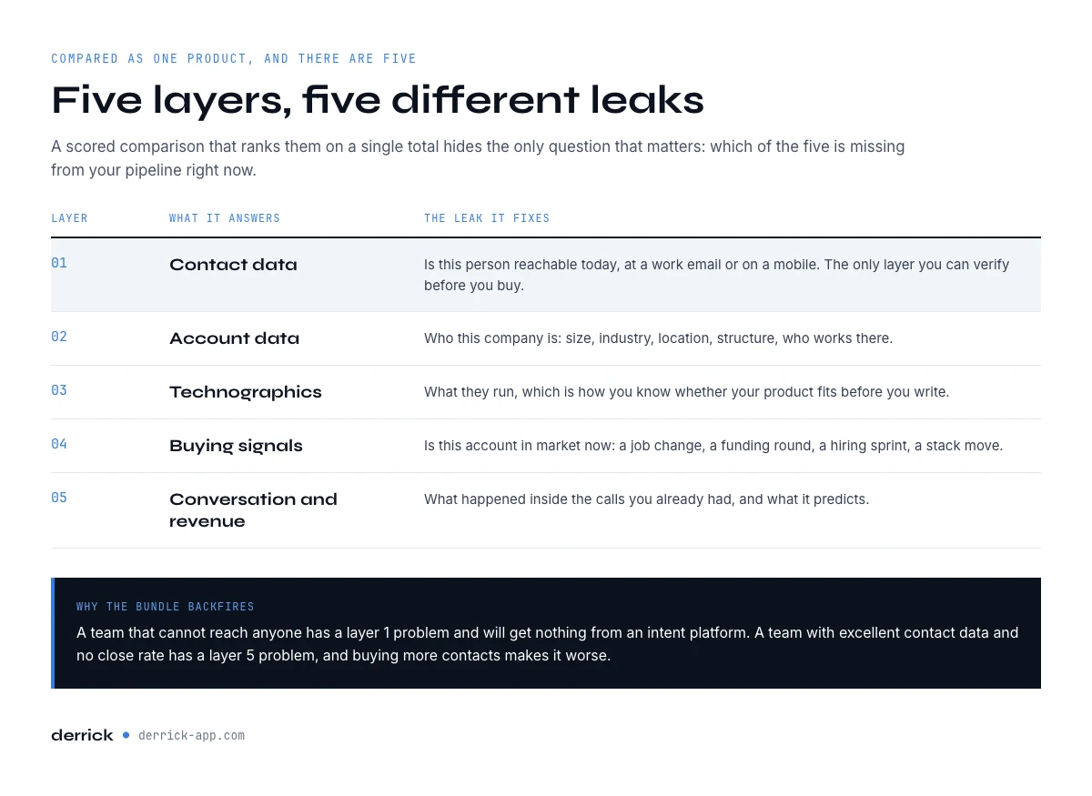
Sales intelligence tools are compared as if they were one product, and they are 5 different ones. A scored comparison that ranks them on a single total hides the only question that matters: which of the 5 is missing from your pipeline right now.
- Contact data. Whether this person is reachable today, at a work email or on a mobile.
- Account data. Who this company is: size, industry, location, structure, who works there.
- Technographics. What they run, which is how you know whether your product fits before you write.
- Buying signals. Whether this account is in market now: a job change, a funding round, a hiring sprint, a stack move.
- Conversation and revenue intelligence. What happened inside the calls you already had, and what it predicts.
Those 5 fix 5 different leaks. A team that cannot reach anyone has a layer 1 problem and will get nothing from an intent platform at 50,000 dollars a year, a list price observed in September 2026. A team with excellent contact data and no close rate has a layer 5 problem and buying more contacts makes it worse. Buying the bundle because it is one purchase order is how a stack ends up costing more than the pipeline it produces. If what you are really shopping for is the enrichment layer alone, our comparison of 51 lead enrichment tools by job takes that apart tool by tool. This page sits inside our wider B2B data providers guide.
What is sales intelligence?
Sales intelligence is the information a seller has about an account before the first contact and during the deal. A sales intelligence platform, sometimes sold as sales intelligence software, is what supplies it. The words are used interchangeably by vendors; what changes between them is which of the 5 layers below they actually own.
Which layer you are missing, before you compare sales intelligence tools
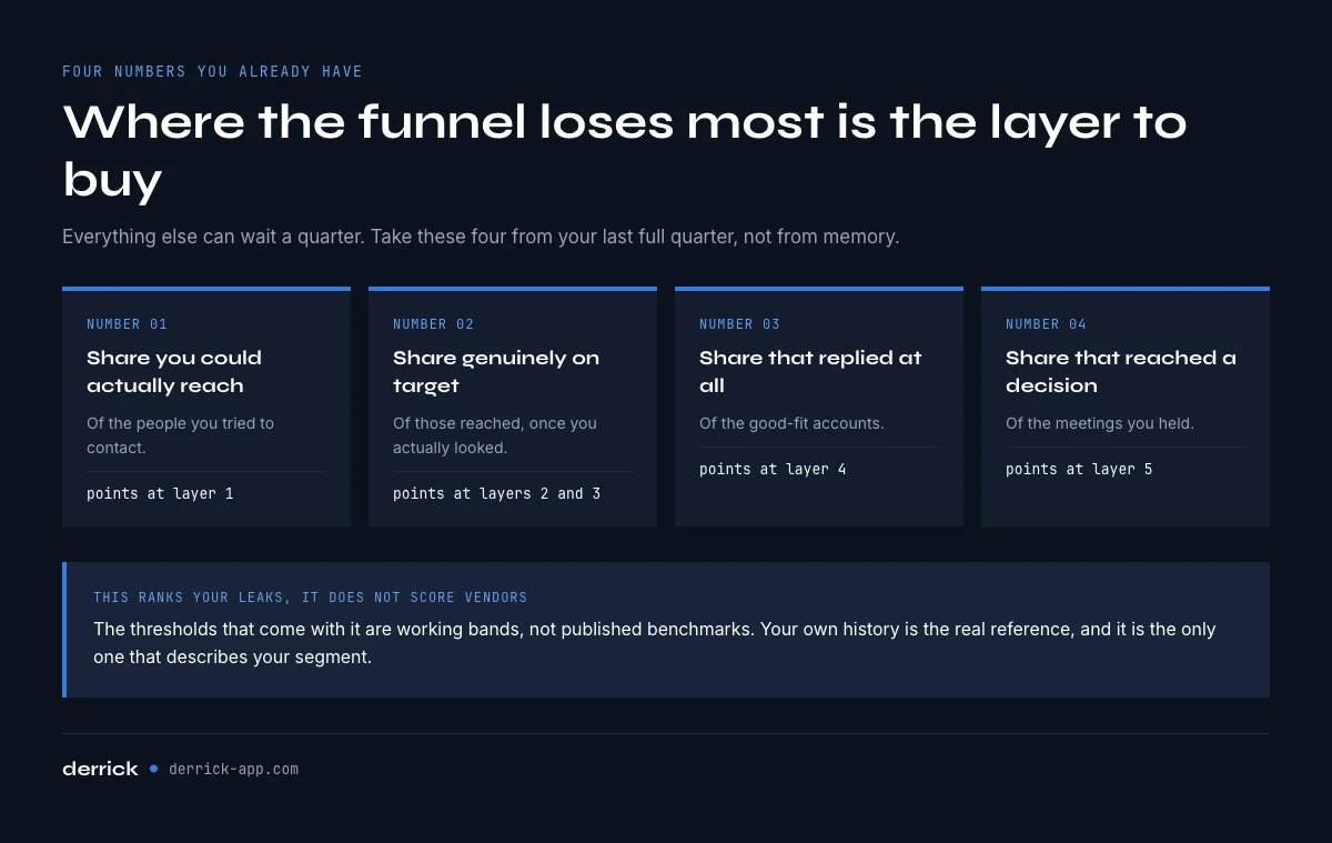
The diagnosis takes 4 numbers you already have. Where your funnel loses the most is the layer to buy, and everything else can wait a quarter.
Which sales intelligence layer is your bottleneck
4 numbers from your last full quarter. Nothing leaves your browser.
Enter your 4 numbers and press Diagnose.
This ranks your leaks, it does not score vendors. The thresholds are working bands, not published benchmarks: below 80% reach, below 60% on target, below 5% reply and below 25% decision rate are the points where each layer usually starts costing more than it returns. Use your own history as the real reference.
Run it on your last full quarter rather than on this month. One bad month moves every number, and the layer you buy on a bad month is rarely the one you needed.
If the diagnosis points at layer 1, the fix is measurable before it is bought: resolve 100 of your own contacts and read the hit rate. Run that test on your own accounts.
Layer 1: contact data, the only one you can verify before you buy
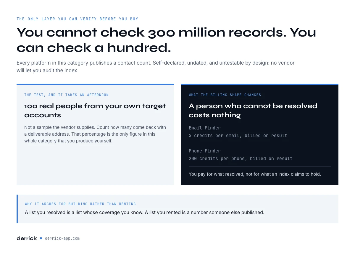
Every platform in this category publishes a contact count, from 200 million to 320 million and up. Those numbers are self-declared, they carry no verification date, and they are not counting the same thing. More importantly they are not testable: you cannot check 320 million records, and no vendor will let you.
What is testable is your own coverage. Take 100 real people from your own target accounts, not a sample the vendor supplies, and count how many come back with a deliverable address. That percentage is the only figure in this whole category that you produce yourself, and it takes an afternoon. It is also the argument for building your own contact database rather than renting one: a list you resolved is a list whose coverage you know.
This is the layer Derrick is built for. Email Finder resolves a work address at 5 credits per email and Phone Finder a mobile at 200 credits per phone, both billed only when a result comes back, so a person who cannot be resolved costs nothing. That billing shape is the concrete difference with a subscription to an index: you pay for what resolved, not for what the index claims to hold. Both sit on the paid plans, from 20 EUR a month, and the free plan and its 100 credits per month cover the import and enrichment side. Measure your coverage on your own accounts.
Layers 2 and 3: account data and technographics
Account data is what turns a list of names into a list of accounts you can qualify: headcount, industry, country, structure, and who actually works there. Technographics is the layer above it, and it is the one that filters hardest, because what a company runs tells you whether your product has a place before you have written a word.
Both are cheap relative to what they save. Enrich Companies fills the firmographics at 1 credit per company, Find Similar Companies turns one good account into a matched list at 1 credit per company, Find a company's people lists current and former staff at 1 credit per person without needing a Sales Navigator seat, and Website Technologies detects the stack at 2 credits per website. Our page on choosing an enrichment provider sets out the 8 criteria to run those against.
The mistake at this layer is buying breadth. A database that covers every industry on earth is worth less to you than one that covers your 3 segments properly, and the coverage figure that matters is again the one you measure on your own accounts rather than the one on the pricing page. Our geographic coverage page explains why match rates move so much between markets.
Account-based vs lead-based sales intelligence
Sales intelligence tools follow one of two working logics. Lead-based tools start from people: you search a job title, get a list of contacts, and qualify the companies afterwards, often by hand. Account-based tools start from companies: you define the accounts that fit, by headcount, industry, stack or a hiring signal, and only then pull the people who matter inside them.
The account-based order is cheaper because it filters before it spends. Qualifying 500 companies at 1 credit each costs far less than resolving 2,000 contacts and finding out that half of them work at accounts you would never sell to. In Derrick both logics live in the same table: enrich the companies first, keep the ones that fit, then run the people search on the accounts you kept and the Email Finder on what is left. The lead-based order is still the right one when the person is the trigger, for example a former champion who just changed jobs.
Layer 4: buying signals, and the timing problem
Intent is the layer with the widest gap between what it promises and what it delivers, because most of it is inferred rather than observed. A signal that says an account read 3 articles about your category is a probability. A signal that says their VP of Sales changed jobs last week, or that they just closed a funding round, or that they are hiring 12 SDRs, is an event. Events are checkable. Inferences are not.
The practical distinction is worth holding onto when you compare platforms: ask which signals are observed events and which are modelled scores, and ask what the recency is. A signal that arrives 6 weeks after the event is a report, not a trigger.
Derrick covers the observed side. Signal tracks leads and accounts for job changes, funding rounds, hiring sprees and stack moves and fires the alert when it happens, from 20 EUR a month, and it bills 1 credit per signal that actually fires rather than per account monitored. Company Hiring Signal shows who is hiring and for which roles at 1 credit per company, and Google News Scraper returns the most relevant recent article per company at 1 credit per news item. For modelled, aggregated intent across a whole category, the platforms built for that do a job Derrick does not: 6sense, Demandbase and Bombora sit on that layer, and it is a genuinely different product from event detection. The provider benchmark shows how far the same gap between claim and measurement runs across the whole category.
Layer 5: conversation and revenue intelligence
This layer is not a data purchase at all, which is why it sits oddly inside comparisons of sales intelligence tools. Conversation intelligence records and analyses the calls you already had; revenue intelligence forecasts from your own pipeline. Gong is the reference product here, and nothing Derrick does overlaps with it: one looks outward at accounts you have not met, the other looks inward at conversations you already had.
It is worth naming because of what it implies for a budget. If your reply rate is healthy and your close rate is not, no amount of contact data or intent fixes that, and every euro spent on layers 1 to 4 is spent on the wrong problem. That is the single most common misallocation in this category, and the scored comparisons cannot catch it because they only rank what they sell.
How we compared these sales intelligence tools
We did not run a scored test of other vendors' products, and this page does not pretend we did. The comparison below sorts 10 sales intelligence tools by the layer each one covers, using each vendor's own public documentation as read on 5 October 2026. Derrick is our product, so its cards come from our own feature pages and the credit costs we bill today.
Every tool was read against the same 7 criteria:
- Layers covered. Which of the 5 layers the product sells itself, as opposed to reaching through an integration.
- Contact verification. Whether an address is checked before you are billed, or simply returned from an index.
- Pricing model. Per seat, per credit, per result or annual platform contract. We give Derrick's prices and no third-party amounts: list prices in this category move faster than any page can follow, and most are quoted on request anyway.
- CRM integration. How the data reaches your CRM: native sync, file export, or API.
- API and MCP access. Whether you can run the data from code or from an AI assistant, not only from a screen.
- Declared data freshness. How often the vendor says records are refreshed. It is a claim, not a measure.
- Declared country coverage. Where the vendor says its data is strongest, again a claim you check on your own accounts.
Each card below keeps 4 lines: who the tool is built for, the layers it covers, its pricing model, and where it stops. The last 2 criteria are left to your own test, because every vendor declares them and none publishes a dated measurement. Read the result as a map, not a ranking: a tool that covers one layer is not worse than one that covers four, it is a different purchase.
B2B sales intelligence platforms compared, layer by layer
These are the 10 B2B sales intelligence platforms that come up most often in this category, placed in the layers they cover. The table gives the map at a glance; the cards underneath say what each one is for.
| Tool | 1. Contact | 2. Account | 3. Technographics | 4. Signals | 5. Conversation | Pricing model |
|---|---|---|---|---|---|---|
| Derrick | Yes | Yes | Yes | Yes (observed events) | No | Credits, per result on email and phone, plans from 0 to 320 EUR a month |
| ZoomInfo | Yes | Yes | No | Yes | No | Annual subscription, quoted |
| Apollo | Yes | Yes | No | No | No | Per seat with credits, sequences included |
| Cognism | Yes | Yes | No | No | No | Annual subscription, quoted |
| Lusha | Yes | No | No | No | No | Per seat with credits |
| BuiltWith | No | No | Yes | No | No | Subscription plans |
| 6sense | No | No | No | Yes (modelled intent) | No | Annual platform contract, quoted |
| Bombora | No | No | No | Yes (category intent) | No | Data licence, quoted |
| Demandbase | No | Yes | No | Yes (modelled intent) | No | Annual platform contract, quoted |
| Gong | No | No | No | No | Yes | Per seat, quoted |
The layers are read from each vendor's public documentation on the date above. Products add modules every year, so treat a "No" as "not what the product is sold for" and check the current scope with the vendor before you rule anything out.
Layers 1 and 2: contact and account data
Derrick. Built for: teams that already hold a target list, or want to build one, and want to pay only for the records that resolve. Layers: 1 with Email Finder at 5 credits per email found, Email Verification at 1 credit per email, Phone Finder at 200 credits per phone found and Enrich Leads at 1 credit per profile; 2 with Enrich Companies and Find Similar Companies at 1 credit per company; plus layers 3 and 4 below. Pricing: credits, from the free plan and its 100 credits a month up to SCALE at 320 EUR a month, which brings a credit down to 0.0016 EUR. Email Finder and Phone Finder sit on the paid plans, from 20 EUR a month. Where it runs: the web app, the Google Sheets sidebar, Claude or any MCP client, and the REST API, with MCP and API from the Plus plan at 47.50 EUR a month. Scope: data and signals; sending stays in the sequencer you already use, where Derrick pushes the enriched leads.
ZoomInfo. Built for: large sales and marketing teams that buy contact, company and intent data under one contract. Layers: 1, 2 and 4. Pricing: annual subscription, quoted on request. Where it stops: you pay for access to the index whatever share of it resolves on your segment, and the commitment is annual.
Apollo. Built for: small and mid-size teams that want a contact database and an email sequencer in the same seat. Layers: 1 and 2, plus sequences. Pricing: per seat, with a credit allowance. Where it stops: data and execution come bundled, so a team that already runs a sequencer pays twice for that half of the seat.
Cognism. Built for: teams that prospect in Europe and buy contact and company data on an annual contract. Layers: 1 and 2. Pricing: annual subscription, quoted on request. Where it stops: it is a subscription to an index, so the cost per usable record depends on its coverage of your own segment.
Lusha. Built for: individual reps who need a quick contact lookup on a profile. Layers: 1. Pricing: per seat, with credits. Where it stops: it is built around the single lookup; account qualification and signals are bought elsewhere.
Layer 3: technographics
Derrick. Website Technologies detects a company's stack at 2 credits per website, in the same table as the contacts and the company data. That placement is the point: the stack filter runs before you spend a credit on resolving people.
BuiltWith. Built for: marketers and market researchers who segment websites by the technology they run. Layers: 3. Pricing: subscription plans. Where it stops: technographics is the product; contacts and signals are not.
Layer 4: buying signals and intent
Derrick. Signal watches the leads and accounts you choose for job changes, funding rounds, hiring sprints and stack moves, from 20 EUR a month, billing 1 credit per signal that fires. Company Hiring Signal shows who is hiring and for which roles at 1 credit per company. Scope: observed events you can check, not modelled scores.
6sense. Built for: enterprise account-based teams that want a model of which accounts are in market. Layers: 4. Pricing: annual platform contract, quoted. Where it stops: modelled intent is a score, not an event you can verify on the account.
Bombora. Built for: teams that want category-level intent data inside the platforms they already use. Layers: 4. Pricing: data licence, quoted, often consumed through partner platforms. Where it stops: it says a company is researching a topic, not who to contact there.
Demandbase. Built for: enterprise marketing and sales teams running account-based programmes with advertising. Layers: 2 and 4. Pricing: annual platform contract, quoted. Where it stops: a platform purchase sized for account-based programmes rather than a lookup tool.
Layer 5: conversation intelligence
Derrick does not cover conversation intelligence: it covers layers 1 to 4. Gong. Built for: sales teams that record and analyse their calls and forecast from their own pipeline. Layers: 5. Pricing: per seat, quoted. Where it stops: it looks inward at conversations you already had and does not source accounts or contacts. Our guide to revenue intelligence platforms covers that layer on its own.
Two patterns come out of the map. The all-in-one sales intelligence platforms sell layers 1, 2 and sometimes 4 behind one annual contract; specialist sales intelligence software covers one layer and leaves the others to you. Neither is right in itself. The right purchase is the layer your diagnosis pointed at, priced in a way you can measure, and that is where Derrick sits: layers 1 to 4, billed on what resolves, run on the list you already hold.
Sales intelligence vs CRM: how they work together
A CRM records what you already know: the accounts you work, the contacts you spoke to, the deals in progress. Sales intelligence brings what you do not know yet: who else fits, how to reach them, and when they are in market. The CRM is the system of record; sales intelligence tools feed it.
The friction sits at the join. Data bought outside the CRM decays inside it as people change jobs and companies change size, and nobody re-checks it. The setup that holds is a loop: enrich records when they enter, re-enrich them on a schedule, and let signals update the accounts that moved. Derrick runs that loop from the web app on an exported list, or through the REST API on a nightly job that writes back to the CRM. Our CRM data enrichment guide covers the sync patterns field by field.
What sales intelligence tools cost, and the number nobody publishes
Entry prices in this category run from a few hundred dollars per user per year to well over 50,000 dollars a year for the account-intelligence platforms, and a full stack is commonly quoted between 41,000 and 173,000 dollars a year. Those are list figures observed in September 2026 and they are not the number that decides anything.
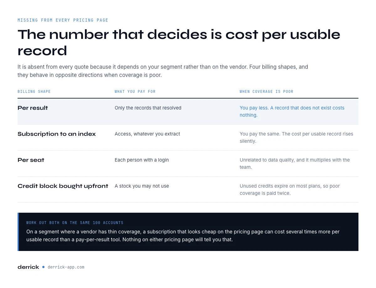
The number that decides is cost per usable record, and it is missing from every pricing page because it depends on your segment rather than on the vendor. It has 2 shapes, and they behave in opposite directions.
| Shape | What you pay for | What happens when coverage is poor |
|---|---|---|
| Per result (Derrick) | Only the records that resolved | You pay less. A record that does not exist costs nothing |
| Subscription to an index | Access, whatever you extract | You pay the same. The cost per usable record rises silently |
| Per seat | Each person with a login | Unrelated to data quality, and it multiplies with the team |
| Per credit block bought upfront | A stock you may not use | Unused credits expire on most plans, so poor coverage is paid twice |
Work out both on the same 100 accounts before you sign. On a segment where a vendor has thin coverage, a subscription that looks cheap on the pricing page can be several times the cost per usable record of a pay-per-result tool, and nothing on either pricing page will tell you that. Our pricing comparison works through the arithmetic.
Seat, credit or platform: the 3 pricing models of sales intelligence software
Across the 10 tools compared above, sales intelligence software is sold on 3 models, and the model tells you more than the list price.
- Seat or annual subscription. ZoomInfo and Cognism on an annual contract, Apollo and Lusha per seat with credits. The cost follows headcount and commitment, not what resolves.
- Credits at use. Derrick: a monthly plan of credits, with Email Finder and Phone Finder billed only per result found. Unused credits never expire as long as the account stays on a paid plan. The cost follows the records you actually get.
- Platform plus services. 6sense, Demandbase and Gong: an annual platform contract, often with onboarding and services, priced on account volume or seats. The cost follows the programme.
The first and third models are bought before you know your coverage; the second is paid after. On a segment where coverage is thin, that order decides the bill.
The vendor scores that are not benchmarks
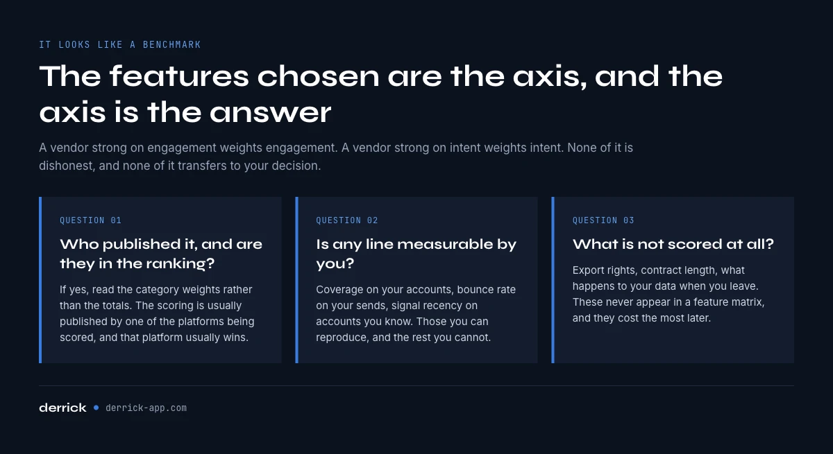
Comparisons in this category increasingly publish a scoring framework: so many features across so many categories, each platform rated out of a total. It looks like a benchmark and it is not one, for a reason that is easy to check and rarely mentioned. The scoring is usually published by one of the platforms being scored, and that platform usually wins.
The features chosen are the axis. A vendor strong on multichannel engagement weights multichannel engagement; a vendor strong on intent weights intent. None of this is dishonest, and none of it is transferable to your decision either. 3 questions turn a score back into something usable.
- Who published it, and are they in the ranking? If yes, read the category weights rather than the totals.
- Is any line measurable by you? Coverage on your accounts, bounce rate on your sends, signal recency on accounts you know. Those you can reproduce.
- What is not scored? Export rights, contract length, what happens to your data when you leave. These never appear in a feature matrix and they cost the most later.
How to choose sales intelligence tools without buying the whole stack
The layered view produces a different buying order than a scored comparison does, and it is usually cheaper by a factor.
Start from the map of the 10 platforms above: find the row of the layer your diagnosis pointed at, and compare only the tools in that row.
| Layer | Who is built for it | How to price it |
|---|---|---|
| Contact and account data (1, 2, 3) | Derrick, on your own list, from the web app, the Sheets sidebar, an AI assistant over MCP or the REST API | Per result. Cost per usable record, measured on your 100 accounts |
| Observed buying signals (4) | Derrick Signal, on the accounts you choose to track | Per signal fired, from 20 EUR a month |
| Modelled category intent (4) | 6sense, Demandbase, Bombora | Annual platform contract, priced on account volume |
| Conversation and revenue intelligence (5) | Gong | Per seat, and unrelated to data coverage |
| All-in-one platforms (1 to 4 bundled) | ZoomInfo, Apollo, Cognism, Lusha | Subscription plus credits. Run the cost per usable record before comparing to per-result pricing |
On the modelled-intent layer and on conversation intelligence, those platforms do work Derrick does not do at all. If your diagnosis points at one of those two layers, that is where your budget belongs, and no amount of contact data will substitute for it. On the data layer, layers 1 to 3, Derrick does better, and the reason is concrete rather than a claim about quality: it charges for records that resolved instead of for access to an index, it runs on the list you already hold rather than on one you rent, and it works at every scale, from a 40 row test to a nightly API job. Start where your diagnosis pointed, measure the layer for one quarter, and add the next one only when the first has stopped being the constraint. If that first layer is the data one, the cheapest way to find out is to run it on your own accounts rather than to read another comparison. Test the data layer on your own list.
Before you sign with any of the sales intelligence tools on this page, run 4 checks that no scored ranking runs for you:
- Data freshness. Ask how often records are refreshed, and on what date the record in front of you was last checked. A refresh cycle counted in months means part of your list has already moved.
- Country coverage. Test on accounts from each market you sell to. Hit rates move a lot between the US and Europe, and between large and small companies; our page on match rates by country explains why.
- Verification at billing. Are you charged for an address that bounces? Per-result billing answers that by construction.
- Exit terms. Contract length, export rights, and what happens to the enriched records when you leave.
Key takeaways
- Sales intelligence tools bundle 5 layers that fix 5 different leaks. Buying the bundle buys 4 layers you may not need.
- Published contact counts, from 200 to 320 million and up, are self-declared and untestable. Coverage on 100 of your own accounts is not.
- Observed events beat modelled intent for triggering outreach, and recency matters more than the score.
- A poor close rate is a layer 5 problem. More contact data makes it worse, not better.
- Vendor scoring frameworks are usually published by a platform inside the ranking. Read the weights, not the totals.
- Cost per usable record is the number that decides, it is on no pricing page, and it takes 100 accounts to produce.
- The 10 B2B sales intelligence platforms compared here sort into layers, not ranks: Derrick covers layers 1 to 4 on per-result credits, 6sense, Bombora and Demandbase sell modelled intent, Gong sells conversation intelligence.
- Sales intelligence feeds the CRM, it does not replace it. Enrich records on entry and re-enrich them on a schedule.
Derrick covers the data layers: contact resolution, company data, staff, technographics, and observed buying signals, from the web app, the Google Sheets sidebar, an AI assistant over MCP or the REST API (MCP and API from the Plus plan at 47.50 EUR a month). Email Finder and Phone Finder bill only when a result comes back, so a record that does not exist costs nothing. They sit on the paid plans, from 20 EUR a month, which is also what the coverage test needs, since resolving 100 addresses spends 500 credits. The free plan and its 100 credits per month cover the import and enrichment side, enough to build and qualify the test list before you spend a credit on resolution. Start with the free plan, or read the rest of the B2B data providers guide.
We publish one email every 2 weeks with what we measure on B2B data coverage, decay and cost. Subscribe from the homepage.
Frequently asked questions
What is sales intelligence, and what are sales intelligence tools?
How are sales intelligence tools different from data enrichment tools?
How much do sales intelligence tools cost?
Can vendor database sizes and scored comparisons of sales intelligence platforms be trusted?
Is intent data worth buying?
What is the difference between sales intelligence and revenue intelligence?
Where does Derrick sit in a sales intelligence stack?
Which layer should a small team buy first?
Keep reading
Continue exploring this cluster


Lead Enrichment Tools: 51 Compared by Job, Free Plan and Price
Read →

How to Choose a B2B Data Enrichment Provider: 8 Key Criteria
Read →

B2B Data Enrichment Tools Pricing: What You Actually Pay in 2026
Read →

Geographic Coverage in B2B Data Enrichment: Why Match Rates Vary
Read →