Last updated: 2026-06-18
Most teams send cold email without knowing whether a 3% reply rate is good, average, or a quiet failure. This 2026 report puts numbers on it: what reply, open, bounce, and inbox placement rates look like across industries, and which lever actually moves them.
The short version: the average cold email reply rate sits around 3.1%, top performers reach 8 to 12%, and the single biggest difference between the two groups is not the copy. It is the quality of the data the campaign was built on. We will walk through the benchmarks metric by metric, then show exactly where the gap comes from and how to close it.
The 2026 cold email benchmark at a glance
Across aggregated 2026 data, the average cold email reply rate is about 3.1%. Top performers land between 8 and 12%, while the bottom of the market stays under 0.5%. That spread is enormous: the best programs are not twice as good as average, they are three to four times better, and the difference compounds across every campaign.
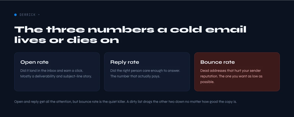
Open rates are noisier. Reported averages range from 27.7% to 44% depending on how Apple Mail Privacy Protection is counted, since it auto-opens messages and inflates the metric. Treat open rate as a soft signal in 2026, and judge campaigns on replies and booked meetings instead. A high open rate paired with a near-zero reply rate usually means the targeting or the offer is off, not the subject line.
List size matters more than most teams expect. Tightly targeted sends under 50 recipients average a 5.8% reply rate, against 2.1% for large blasts. Smaller, cleaner, better-researched lists win. Volume without precision is the fastest route to the bottom quartile, because every extra unqualified or invalid contact drags down both your response rate and your sender reputation at the same time.
One word of caution on averages: a single blended number hides more than it reveals. A 3% reply rate can mean a healthy campaign to a clean, well-targeted list, or a large blast where a handful of replies are buried under thousands of wasted sends. Always read the average alongside two companions: your bounce rate, which tells you whether the list was real, and your reply rate by segment, which tells you whether the targeting was right. Those two numbers explain almost every gap between an average campaign and a top one.
Reply and open rates by industry
Reply rates vary widely by vertical. Recruiting and staffing sit at the top, partly because the offer is concrete and timely. Software and SaaS sit at the bottom, where inboxes are saturated with near-identical outreach. Use the table below as a realistic target band, not a guarantee, and compare yourself to your own industry rather than the global average.
| Industry | Typical reply rate |
|---|---|
| Recruiting and staffing | 4 to 8% |
| Legal services | up to 10% |
| Marketing agencies | 3 to 6% |
| B2B SaaS (SMB) | 3 to 6% |
| IT and managed services | 3 to 5% |
| Financial services | 2 to 4% |
| Manufacturing | 2 to 4% |
| Enterprise SaaS | 1 to 3% |
| Healthcare | 1 to 2% |
Open rates follow a similar split. Software leads at roughly 47%, while consumer goods and banking sit near 19 to 20%. The gap is less about the subject line and more about whether the address is real and the sender is trusted. An invalid address never opens anything, and a flagged sender lands in spam where opens do not happen, which is why deliverability sits upstream of every other number.
The deliverability benchmarks that decide everything
A reply rate is capped by how many messages actually reach the inbox. In 2026, median inbox placement ranges from about 86% in education to 92% in B2B SaaS. A good rate is 87% or higher, which puts you in the top quartile of senders. Excellent programs clear 93%. The United States average sits near 85%, and Europe slightly higher at 89.1%.
Bounce rate is the first thing mailbox providers watch. A well maintained list keeps the overall bounce rate around 1.2%, with hard bounces, the permanent failures from invalid addresses, under 0.5%. The B2B average is higher at 2.33%, so keeping yours under 2% already puts you ahead. Above 5% is a red flag that damages sender reputation for weeks, and recovery is far slower than the damage.
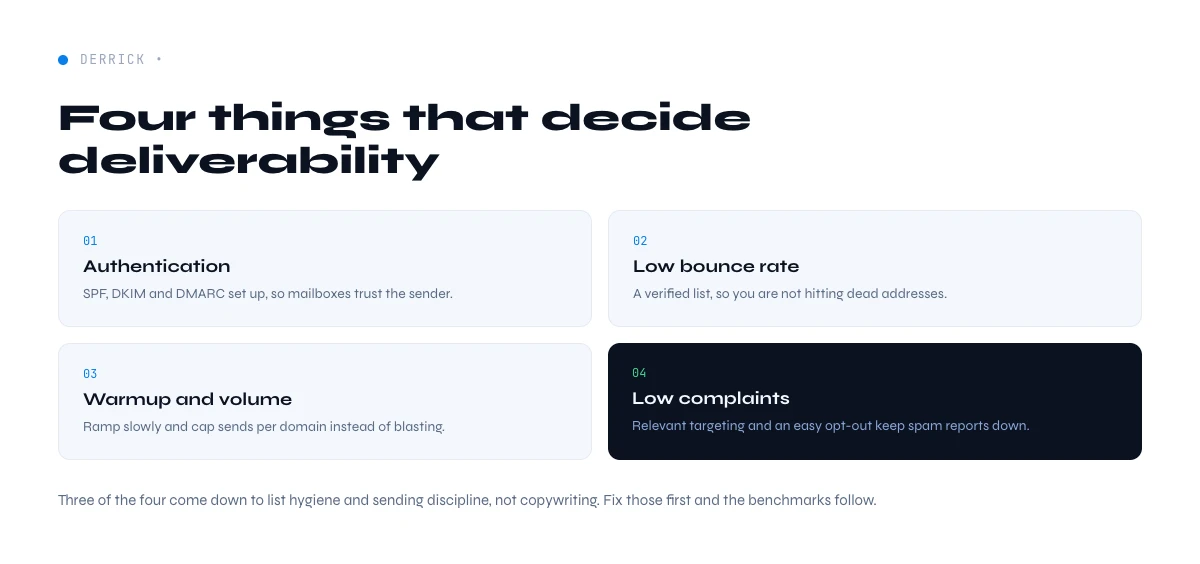
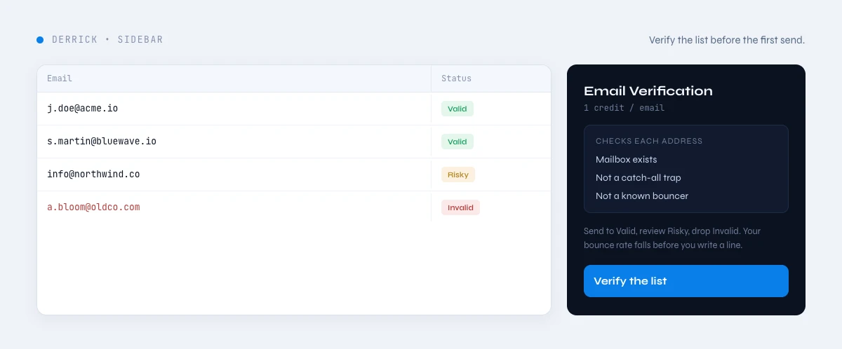
The metric mailbox providers weigh most heavily in 2026 is the spam complaint rate. A healthy baseline is under 0.08%, roughly one complaint per 1,250 messages. Gmail surfaces it directly in Postmaster Tools and uses it in placement decisions. Authentication is now table stakes too: the full-compliance benchmark for SPF, DKIM, and DMARC sits around 82%, and senders below it are increasingly filtered by default. Want to pressure test a single address before you send to the whole list? A bounce email checker flags invalid mailboxes in real time, and real time verification does it at the moment of capture. Two checks matter most: confirming an address is a valid, deliverable mailbox, and detecting catch-all domains that accept everything and quietly inflate your risk.
Monitoring closes the loop. Google Postmaster Tools reports your domain reputation, spam rate, and authentication status against the same thresholds providers use, so you can catch a problem before it tanks a campaign rather than after. Enroll in feedback loops where they exist, watch the trend rather than a single day, and treat any sustained rise in complaints or bounces as a signal to pause and clean rather than push harder. The senders who stay in the top quartile are not the ones who never have a bad day, they are the ones who measure early and react fast, because reputation recovers slowly once it slips.
What separates top performers from the average
The programs that hit 8% or more replies share a pattern, and it is rarely a clever subject line. They send smaller, segmented lists, they research before they write, and they follow up. The 5.8% reply rate on sub-50 sends versus 2.1% on large blasts is the clearest evidence: relevance beats reach.
Personalization that uses a real signal, a recent role change, a shared market, a specific pain, consistently outperforms generic merge tags. Multi-step sequences matter as well, since most replies arrive on the second or third message rather than the first. But none of this works on a list full of dead or wrong addresses, because the sequence never reaches a real person. Targeting, personalization, and follow-up are multipliers on top of clean data, not substitutes for it.
Cadence is the other quiet differentiator. Top performers space their follow-ups over one to three weeks and stop cleanly after three or four touches, rather than firing daily and burning the relationship. Each additional well-timed message recovers a share of non-responders, which is why a sequence reliably outperforms a single send. The compounding effect is real: if a first email replies at 2% and two follow-ups each recover another 1 to 2%, the campaign-level reply rate lands in the top band without any single message being exceptional. Reach, relevance, and patience together explain most of the distance between a 2% program and an 8% one.
The real lever: clean data, not better copy
Here is the finding that reframes the whole report. Verified email lists reply about 2 times more than unverified ones, and 5 to 6 times more than purchased lists. The same sequence, sent to a clean list instead of a stale one, moves a campaign from the bottom band to the top band without changing a single word of copy.
The reason is mechanical. Invalid addresses bounce, bounces raise your failure signals, mailbox providers throttle you, and your genuinely good prospects stop seeing your messages. Email lists also decay by at least 25% per year as people change jobs and abandon addresses, so a list that performed last quarter quietly rots. List hygiene is not a one time cleanup, it is a standing input you maintain before every send.
This is where the data layer earns its keep. Email Finder sources prospect emails directly in Google Sheets at 5 credits per found email, and Email Verification validates each address for 1 credit per email so invalid contacts never enter the send. Derrick runs both from the Google Sheets sidebar, with 100 free credits per month and no credit card to start. Clean data in, better benchmarks out. For the full picture of building a reliable email list, see the email finder guide.
Start verifying and finding emails with Derrick, free for 100 credits per month, directly inside Google Sheets.
Sending setup that protects deliverability
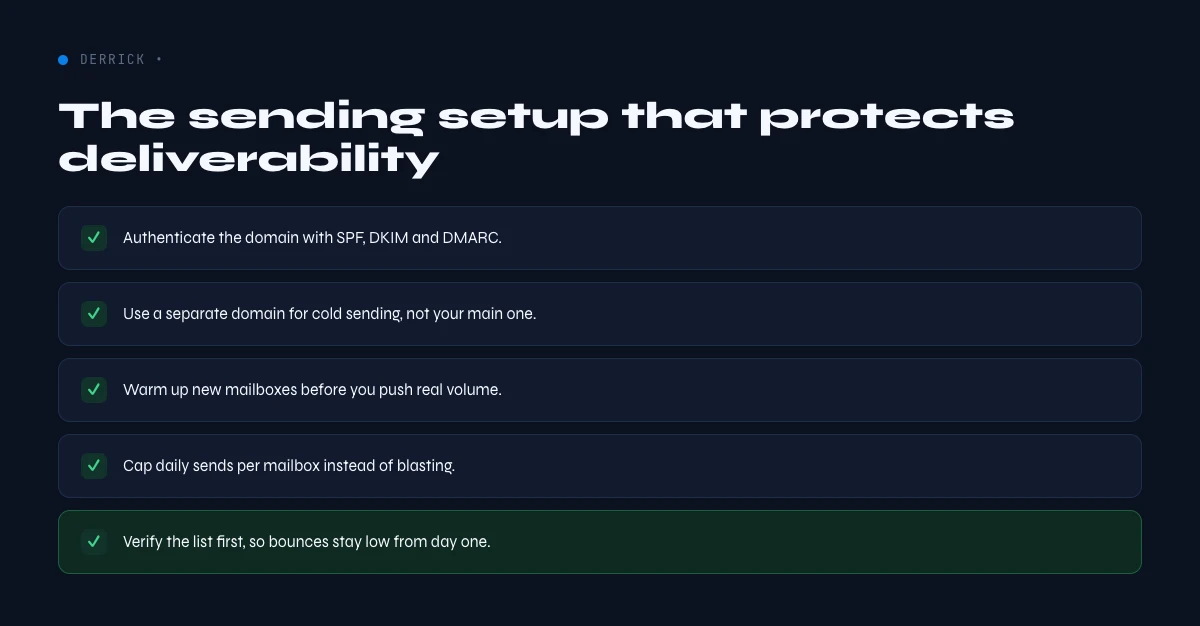
Even a clean list underperforms on a weak sending setup. Three foundations carry most of the weight. First, authentication: publish SPF, DKIM, and DMARC records so mailbox providers trust your domain, since the 82% compliance benchmark means non-compliant senders now stand out for the wrong reason. Second, warmup and volume ramp: new domains and mailboxes need to build reputation gradually rather than blasting thousands of messages on day one. Third, a dedicated sending domain separate from your primary domain, so a campaign issue never threatens your corporate email.
None of these fix bad data, and bad data undoes all of them. The order of operations is consistent: verify the list, warm the infrastructure, segment tightly, then personalize and follow up. Teams that invert this order, polishing copy on a stale list and a cold domain, stay stuck in the bottom bands no matter how good the writing is.
How to benchmark your own numbers
Use the self-assessment on this page to position your reply, open, and bounce rates against the 2026 bands in seconds. As a manual rule of thumb: a reply rate of 3% or more is at or above average and 8% or more is top of market, an open rate above 40% is strong and below 25% is low, and a bounce rate at or under 0.5% is excellent while anything over 5% needs immediate list cleaning.
If your bounce rate is high or your reply rate is low, start with the data before rewriting the sequence. Verify the list, remove the dead addresses, and re-measure after one or two sends. List hygiene improvements typically show up within one to two campaigns as invalid addresses drop out, which makes data the fastest available lever and the one most teams skip.
Three benchmarking mistakes show up again and again. The first is treating a high open rate as success, when in 2026 it is inflated by privacy features and says little about interest. The second is comparing yourself to the global average instead of your own industry band, which sets a target that is either too soft or impossibly hard. The third, and the most expensive, is judging copy while ignoring deliverability: a beautifully written sequence sent to a stale list with a 6% bounce rate will always lose to an average sequence sent to a verified one. Benchmark the inputs, not just the outputs. When a number looks off, check the bounce rate and the segment before you touch the words.
Methodology and sources
The figures in this report aggregate independent 2026 deliverability and outreach benchmarks, including published data from Validity, Brevo, Dotdigital, and Cleanlist, normalized into comparable bands. Ranges are presented as bands rather than single points because performance depends heavily on industry, list quality, and sending infrastructure. Treat them as targets to beat, not promises. We deliberately exclude single vendor numbers that cannot be cross checked, and we update the report as fresh annual data is published. Where sources disagree, we favor the more conservative figure, so the bands you see are realistic floors to clear rather than best-case marketing numbers. If your own data sits inside a band, you are performing in line with the market for your segment, and the fastest way to move up a band is almost always cleaner data.
Frequently asked questions
What is a good cold email reply rate in 2026?
What is a good cold email open rate in 2026?
What bounce rate is acceptable for cold email?
What inbox placement rate should I aim for?
Does verifying my email list really improve reply rates?
How do I benchmark and improve my own cold email numbers?
Continue exploring this cluster
Start enriching your sheet in 30 seconds
Free for 100 credits/month. No credit card.
Install Derrick free →